Accessible rail travel passes in Europe
Eurail / Interrail
I worked more than three years at Eurail / Interrail, where I contributed to various business critical applications, such as the app, purchase flows and reservations. I also kickstarted the Design System and advocated for Accessibility, which are both still large ongoing efforts.
About the Pass
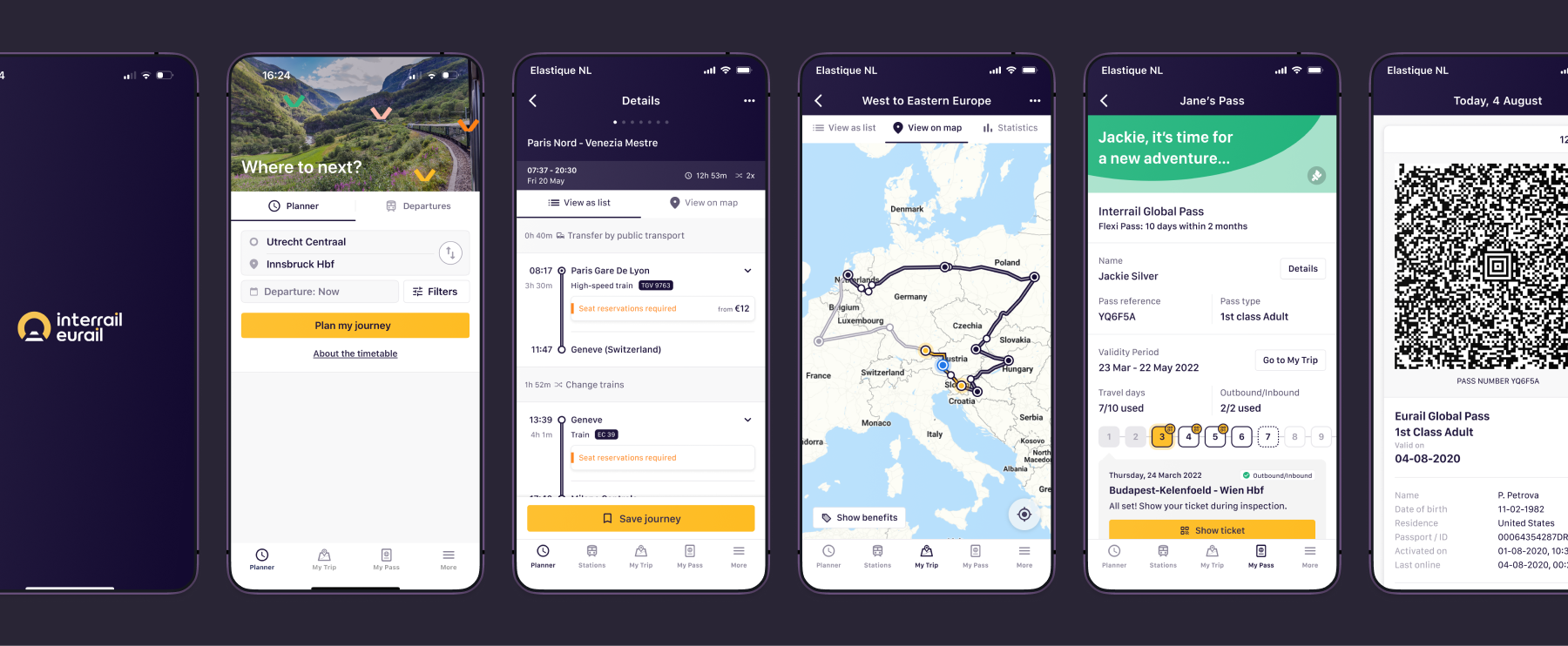
A Eurail or Interrail Pass allows you to board trains all across Europe with a single ticket. For that you'll have to use travel days. The most popular pass is the Global Pass, which allows you travel through all 33 participating countries in Europe.
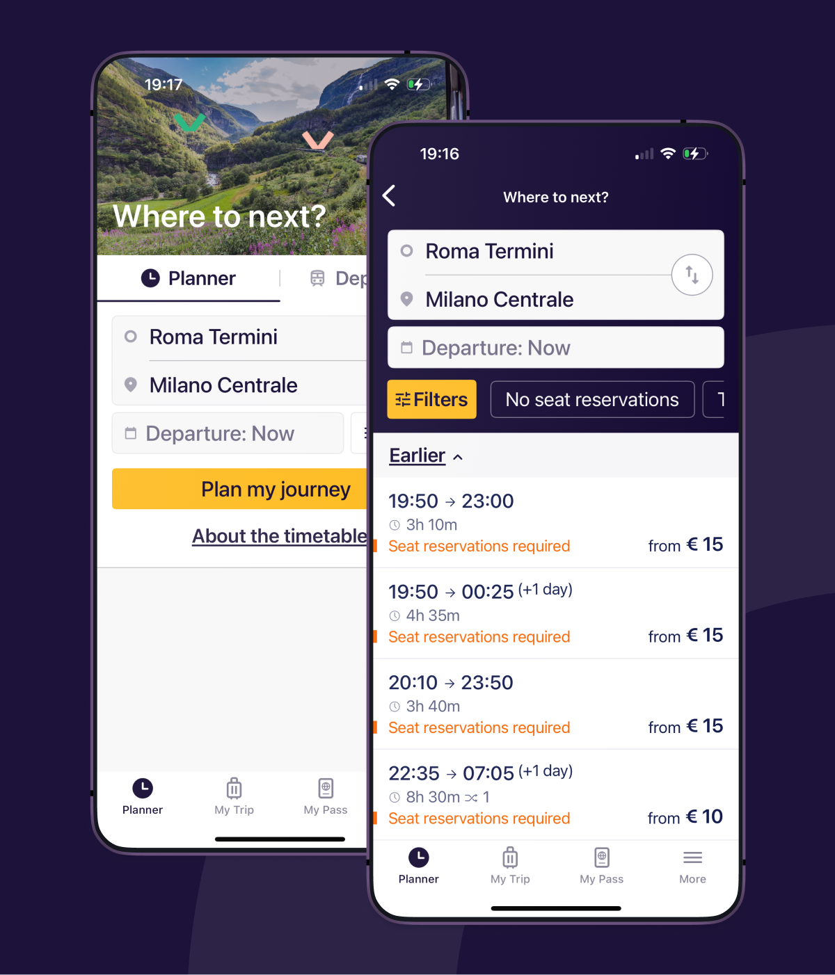
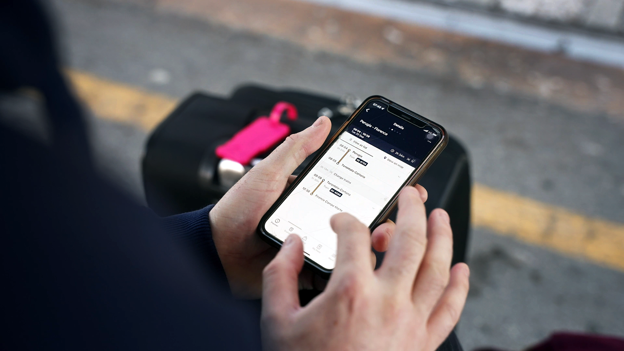
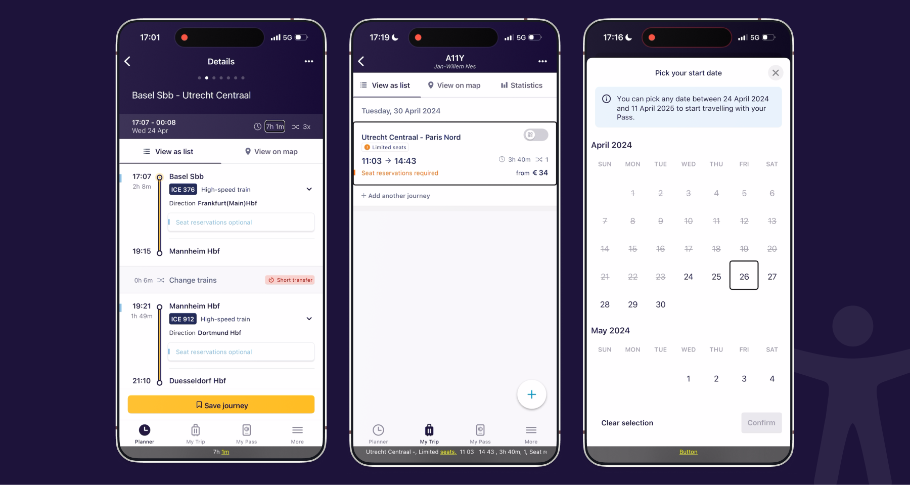
In 2018, Eurail partnered up with Elastique to transform the traditional paper ticket experience into a digital travel companion: the Rail Planner App. The app offers a timetable showing data from all railway carriers. Users can save journeys, create an own itinerary and generate tickets that allows them to board almost any train for a day. Some trains require a reservation to board in order to use a seat or sleeper cabin.
Design System
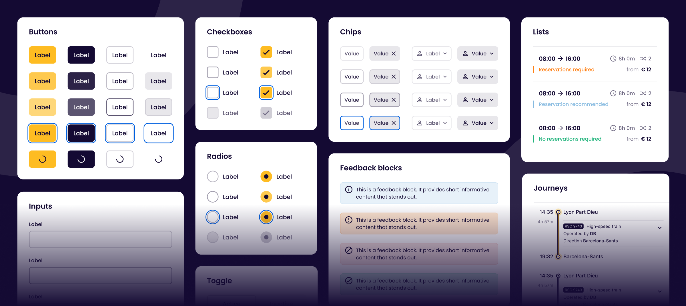
My journey at Eurail started in 2022 when the UX team was very small. Although we had bi-weekly design catchups, we worked pretty isolated. I suggested to collaborate more and create a shared system of knowledge and components across teams.
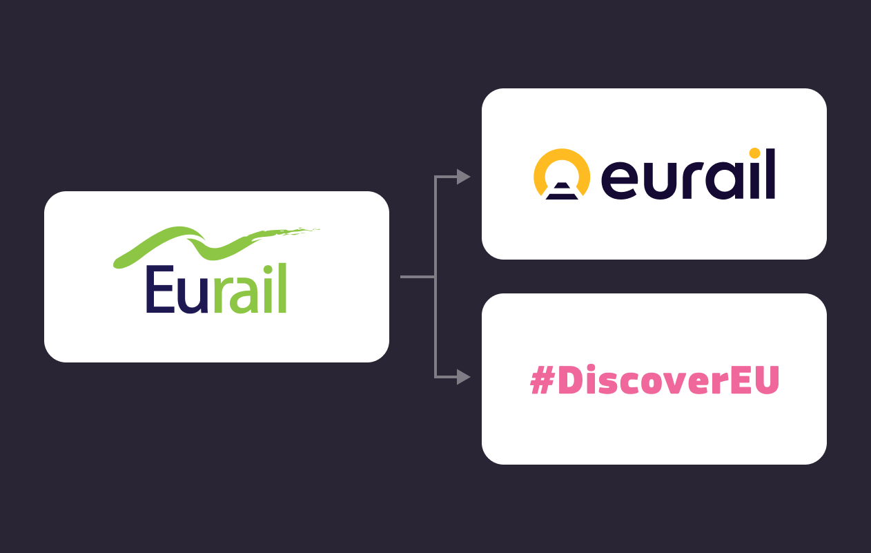
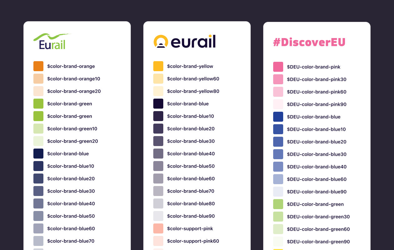
Rebranding and DiscoverEU
We faced two major deadlines. The first was a company-wide rebranding. The second was DiscoverEU — a new partnership with the European Commission that enables young people to travel freely through Europe and connect with different cultures. Our goal was to create a new DiscoverEU app built on the existing infrastructure of Eurail's Rail Planner App.
Without a component library in place, we faced a significant challenge: we needed to create new account flows and adapt our existing color scheme into two new variants—one for the rebranding and another for DiscoverEU.
Components
I proposed to switch from Sketch to Figma for its robust library support and made a serious effort to define and build our components. I also organised a few workshops for anyone new to Figma, covering auto-layout, layering, and component creation. We started meeting every week to sync, introduce new components and define design guidelines. Our collaboration increased and so did the quality of our work.
I continuously kept working on our little design system by taking care of our components and meeting with the Frontend guild.
Continuous improvements
Using observations from customer feedback, user tests and analytics, we identified pain points and areas that cause friction. For the app, I did improvements on the pass activation flow and on the timetable search. For the website I’ve worked on purchase flows, such as pass selection and checkout, but also refunds.
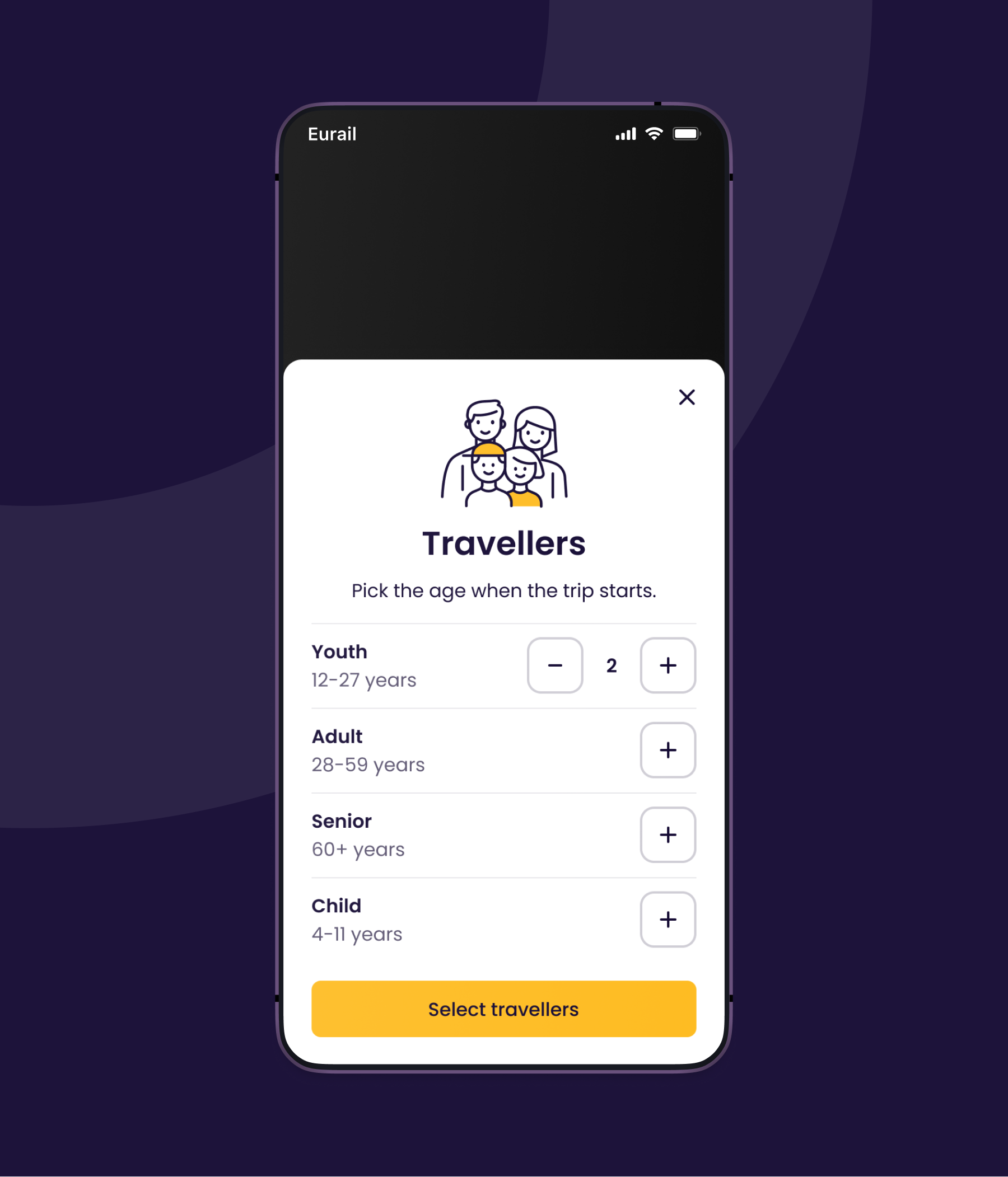
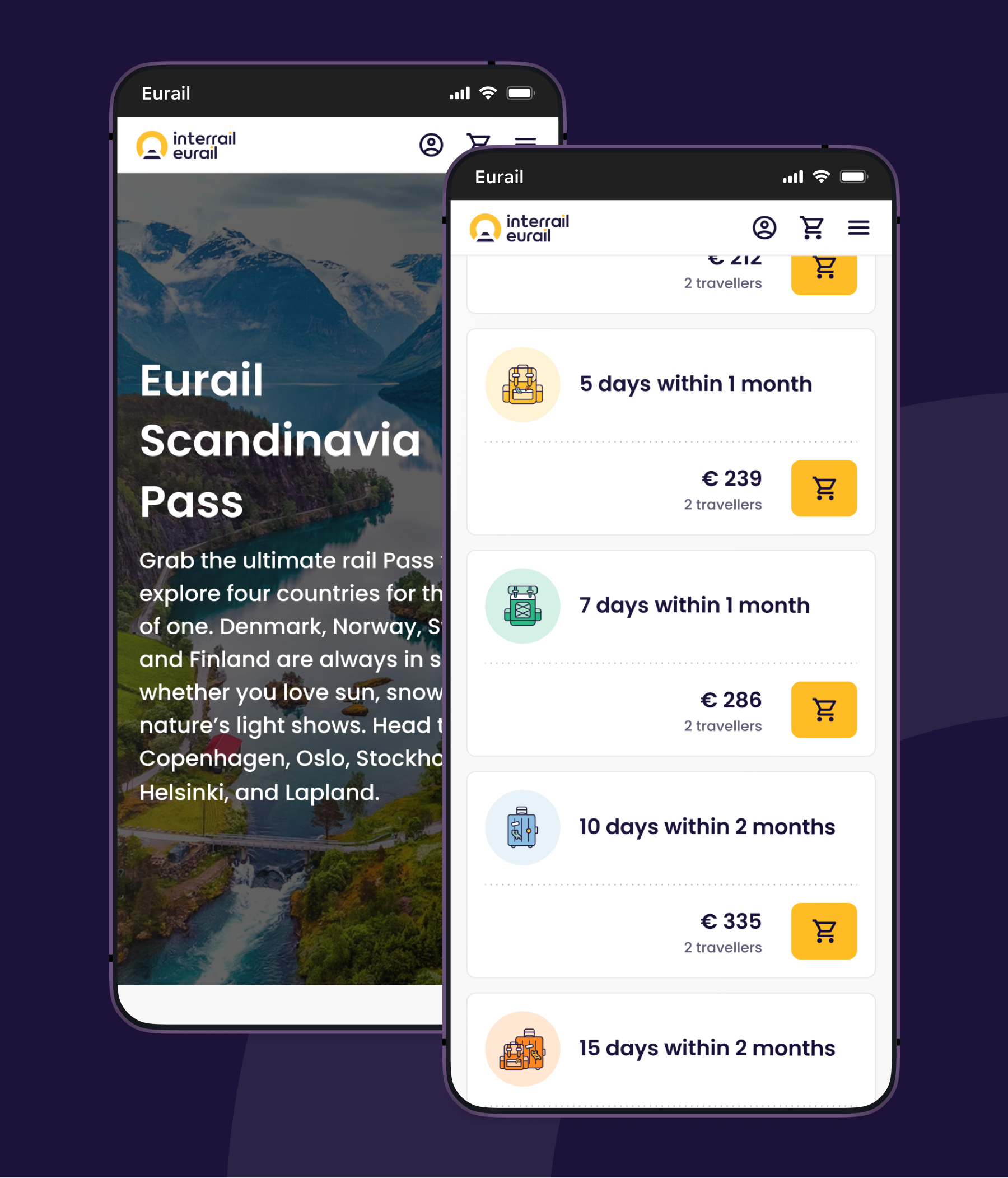
Traveller selection
A Pass is offered in different price ranges. Youths and Seniors are eligible for a discount. Adults pay the full price, but can take up to two children along on their trip. Age is ultimately verified during checkout, but users have to select travellers first so we can show correct prices.
I designed a new traveller selection component which solves some problems opposed to our previous method:
- One consistent selection experience across our website
- No default youth selection
- No disabled buttons
- Contextual information and feedback instead of a lengthy tooltip
- Saves the selection in local storage
Pass pages
For 2 years I've worked on the main purchase flows. While there's still exciting improvements on the development backlog I cannot make public, my activities involved:
- Analysing customer feedback
- Optimisations
- Workshops
- Promotions
- Concepts
- User tests
- (Multiple) Experimental projects
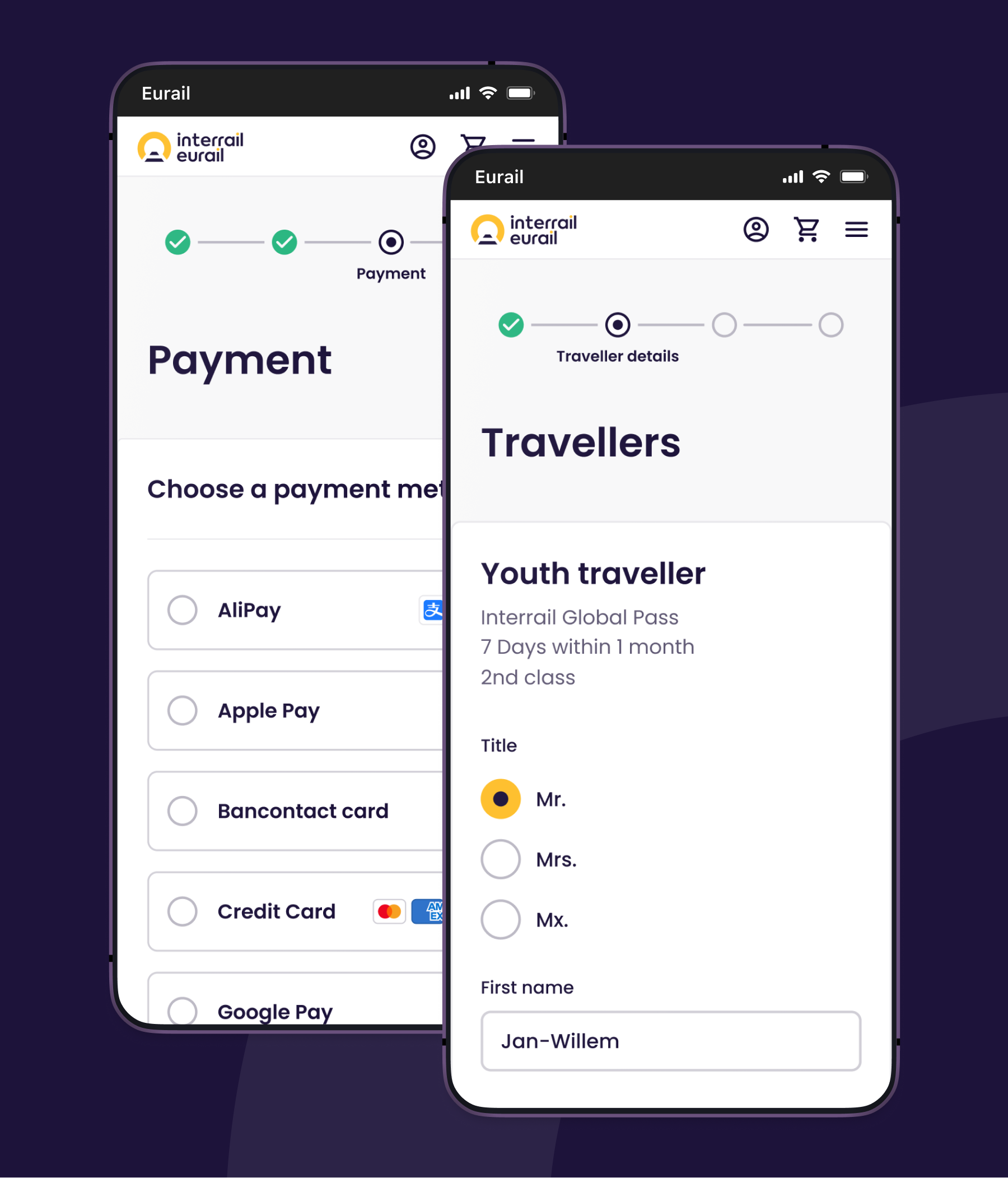
Checkouts
Users have to provide their personal details for the pass during the checkout before they make a purchase. At the moment of time, changing details at a later stage is not possible except through customer service to prevent unwanted resellers and fraud. It's therefore essential to capture correct data and minimise mistakes.
Essential pointers
- Maintain trust
- Gather correct data
- Minimise errors
- Provide feedback if needed
- Increase checkout speed
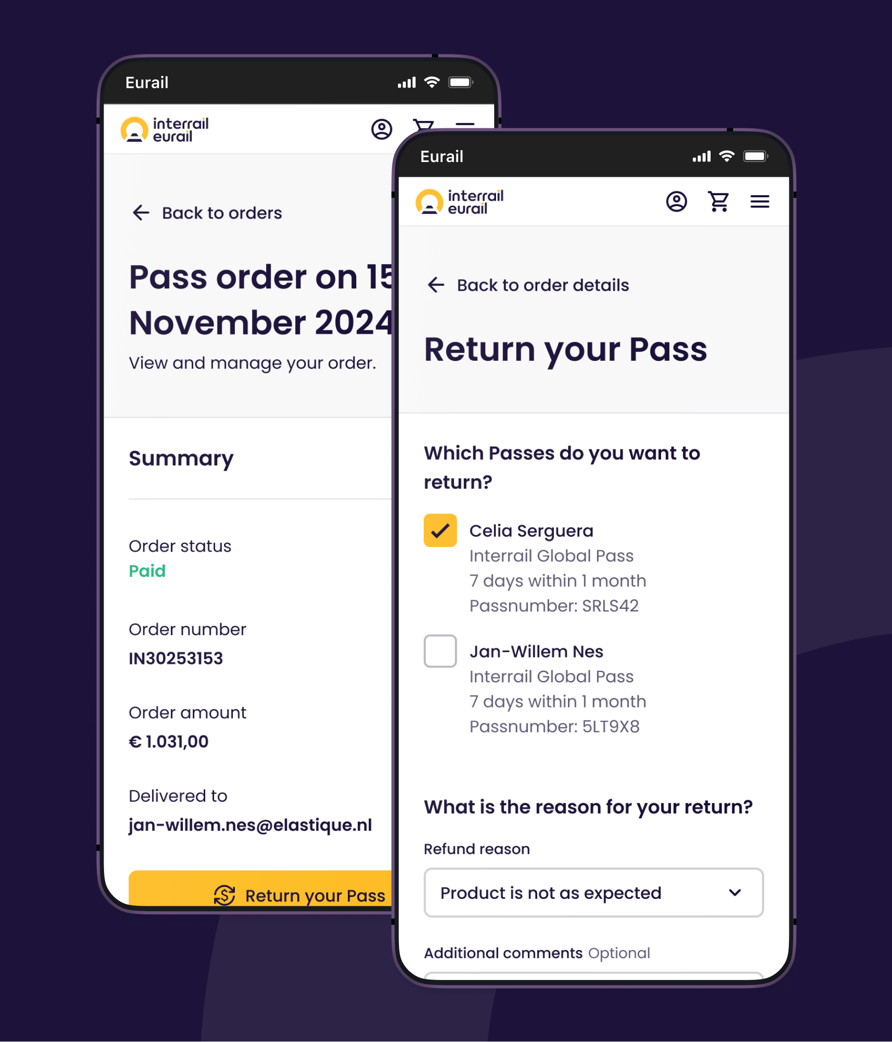
Refund process
My goal was to provide a pleasant online return process for passes that is not only simple, fast and transparent, but also lays a solid foundation for future improvements.
I addressed the following pain points:
- Not showing refund fees
- Not showing non-refundable Passes
- Not showing prices in the order overview
- Returned passes were not communicated in group orders
- Unable to access refunds from the order overview
- Unable to access the order overview from refunds
- Non-chronological sorting
- Conditions were only shared in FAQ’s and terms & conditions
- Refunds occasionally happening by accident
Making a case for Accessibility
I was really concerned about accessibility not being part of our processes, so I decided to recruit a small team and do research on our website and app. I did a pitch, introduced the European Accessibility Act and shared our research findings to the company during an innovation month.
While it wasn't entirely innovation, accessibility did win! This meant it was suitable to become an epic and Eurail was committed to resolve issues with high priority. I was asked to become epic owner to supervise our progress, educate colleagues by giving guidance and plan ahead.
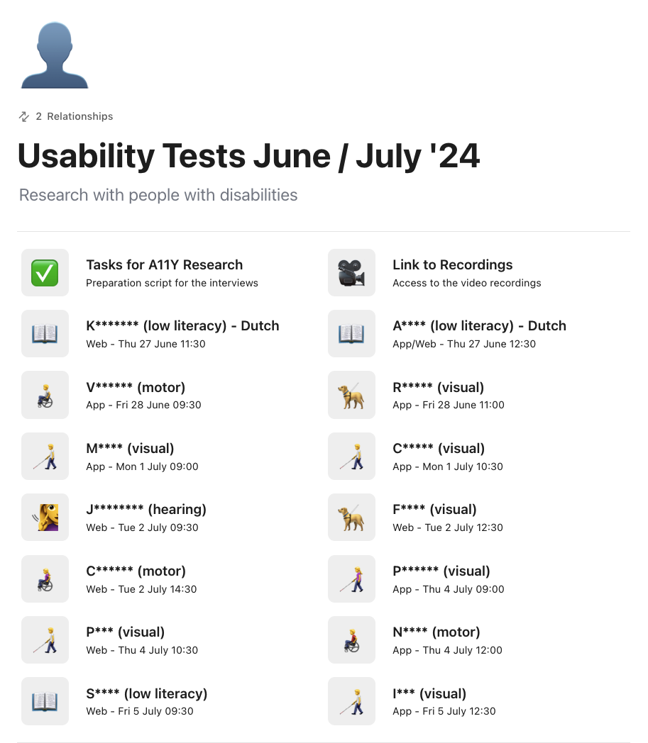
Automated and manual testing
In our research phase we used different methods to test our app and website, such as keyboards, screenreaders, extensions and code inspectors.
Testing ourselves is helpful and can prevent a lot of errors, but the best feedback is received by asking users with impairments to try our services. We invited users with the following disabilities:
- Visual
- Cognitive
- Motoric
- Hearing
- Low literacy
Sadly some of our core functionalities just didn't work for them, which made it impossible to travel.
Accessibility efforts
The results shocked us all and set our product teams in motion, resulting into actively curing weak spots and improving our design- and code quality. We were all learning along the way and are all committed to fix things. Everyone became a lot more conscious about our design and code decisions which will help us to catch issues sooner and resolve them faster!
So far we've improved:
- Components
- Tab/Focus order
- Empty buttons
- Dynamic Type
- Alternative text