A more accessible Interrail travel experience
Interrail
Looking back at my multi-year journey at Interrail, where I contributed to further shaping the mobile travel pass, the partnership with DiscoverEU and reducing complexity in the purchase and reservations services. I also kickstarted the design system and accessibility intiative for the website and app.
- User research
- Accessibility
- Design system
- Branding
- Web design
- App design
Starting out
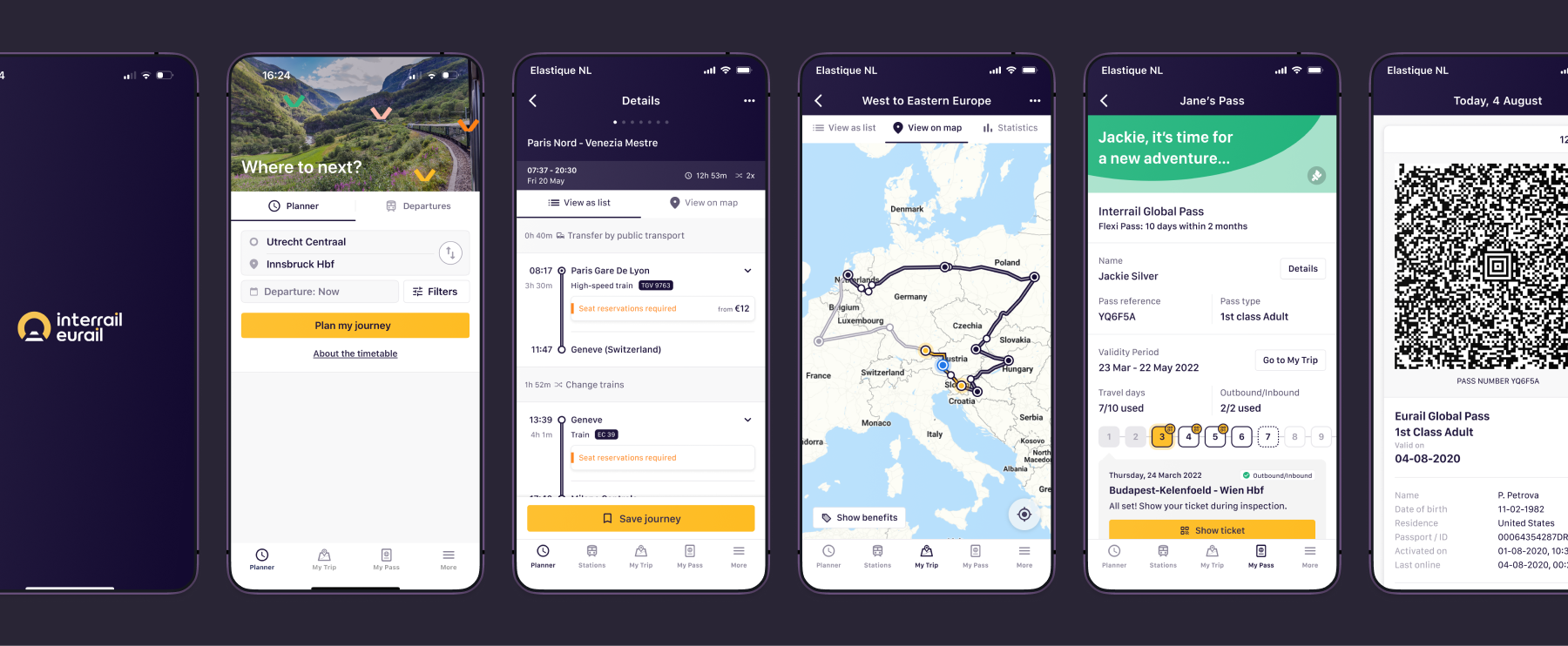
When I joined, the UX team was quite understaffed, consisting of just a few people. As the team grew, we had to step up and move away from doing isolated design tasks and work as a cohesive team that bridges teams for alignment and consistency. For this we scheduled weekly design check-ins. Our main goal was to bridge the gap between the website and the mobile travel app to create one smooth journey for our travelers.
There's much to cover in this case study, so I've divided it into four chapters.
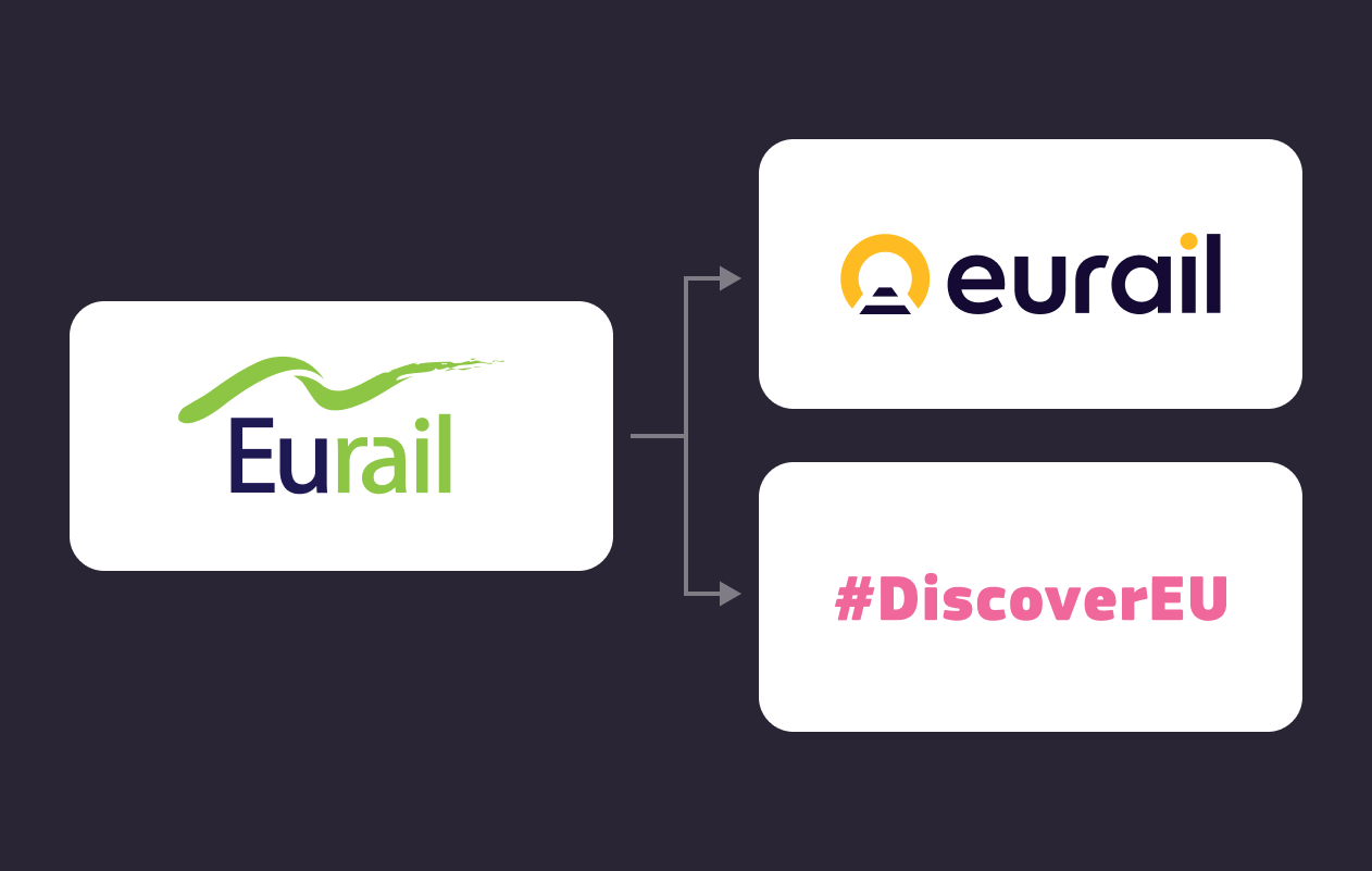
Chapter 1: Scaling the rebranding and launching DiscoverEU
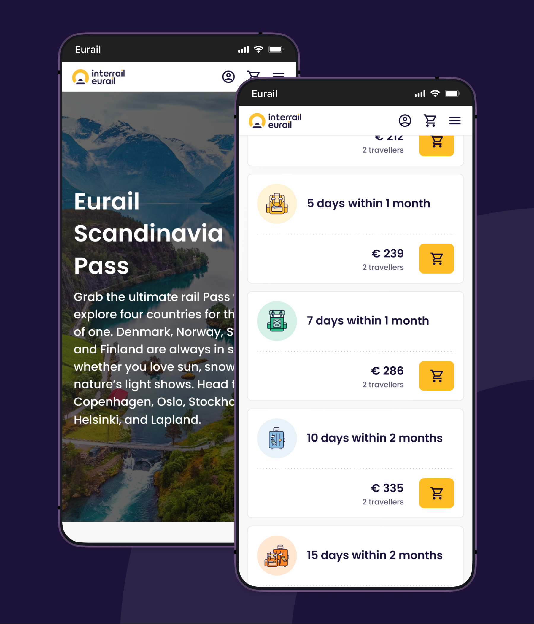
My first task was bringing the Interrail rebranding into our digital products, while also launching DiscoverEU: an initiatve from the European Union that gives 18-year-olds the chance to travel across Europe for free. For us, this meant over 700,000 new travellers and counting, and a very strict 3-month deadline to get everything ready.
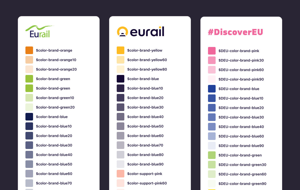
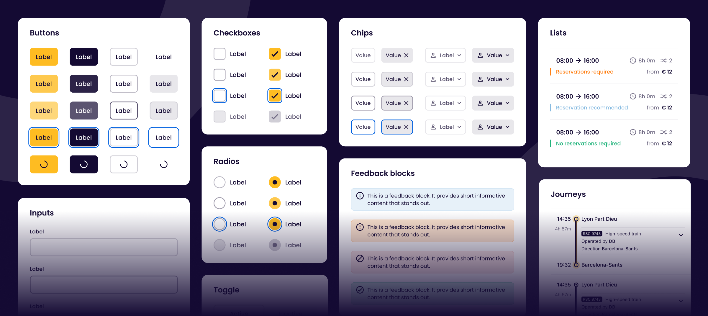
The need for a design system
We needed to ensure both the Interrail and DiscoverEU brand feels consistent across different screens and platforms. The only way to achieve this was to build a well defined component library or design system. And we needed it fast.
What was done:
- Mapping the old color palette to two new color palettes
- Migration of design files from Sketch to Figma
- Identified and simplified components
- Introduced new components
- Bi-weekly design system alignments
- Continuous collaboration with app and web development
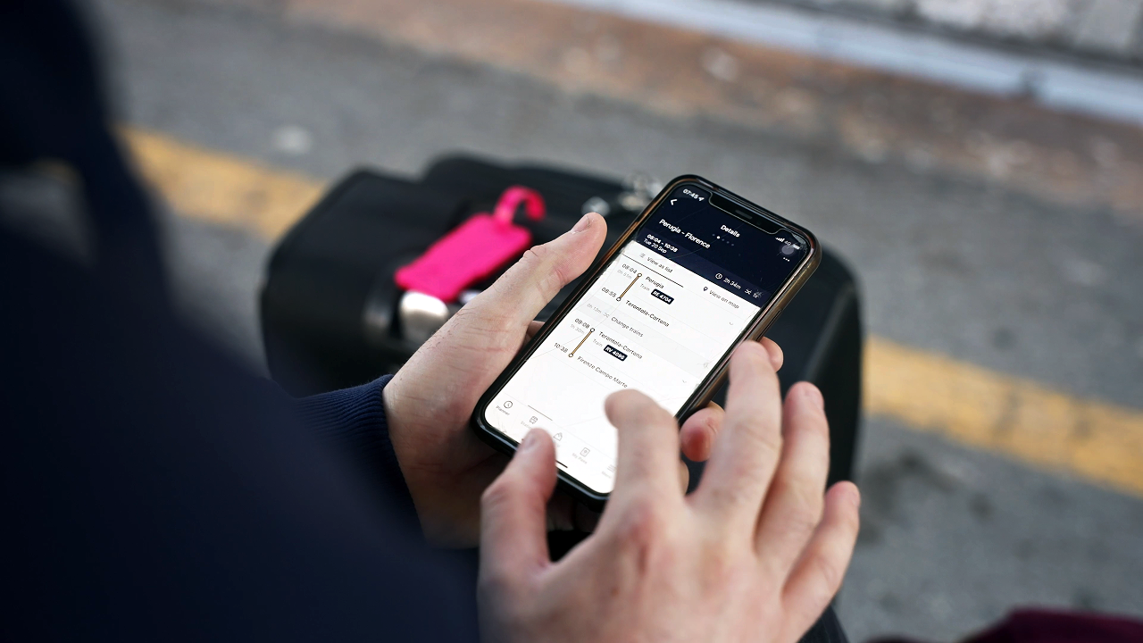
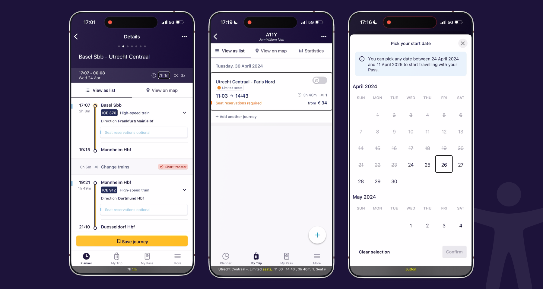
I also focused on improving a few usability issues with the mobile travel app, including refining the timetable search and activation of travel days.
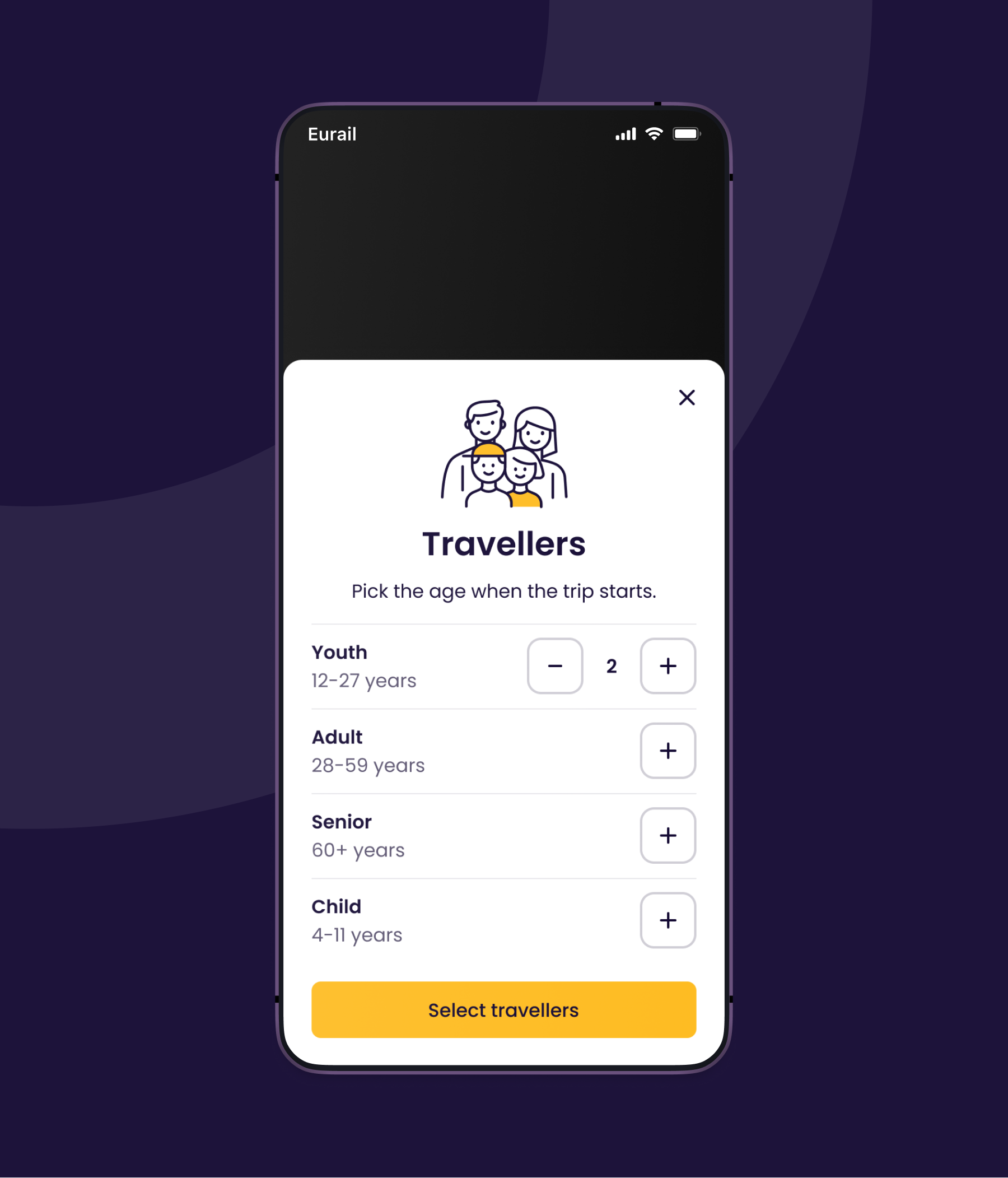
DiscoverEU also required us to work on a My Account functionality for the app. We also promised to deliver 'Green Route' itineraries and easier ticket access for group travel.
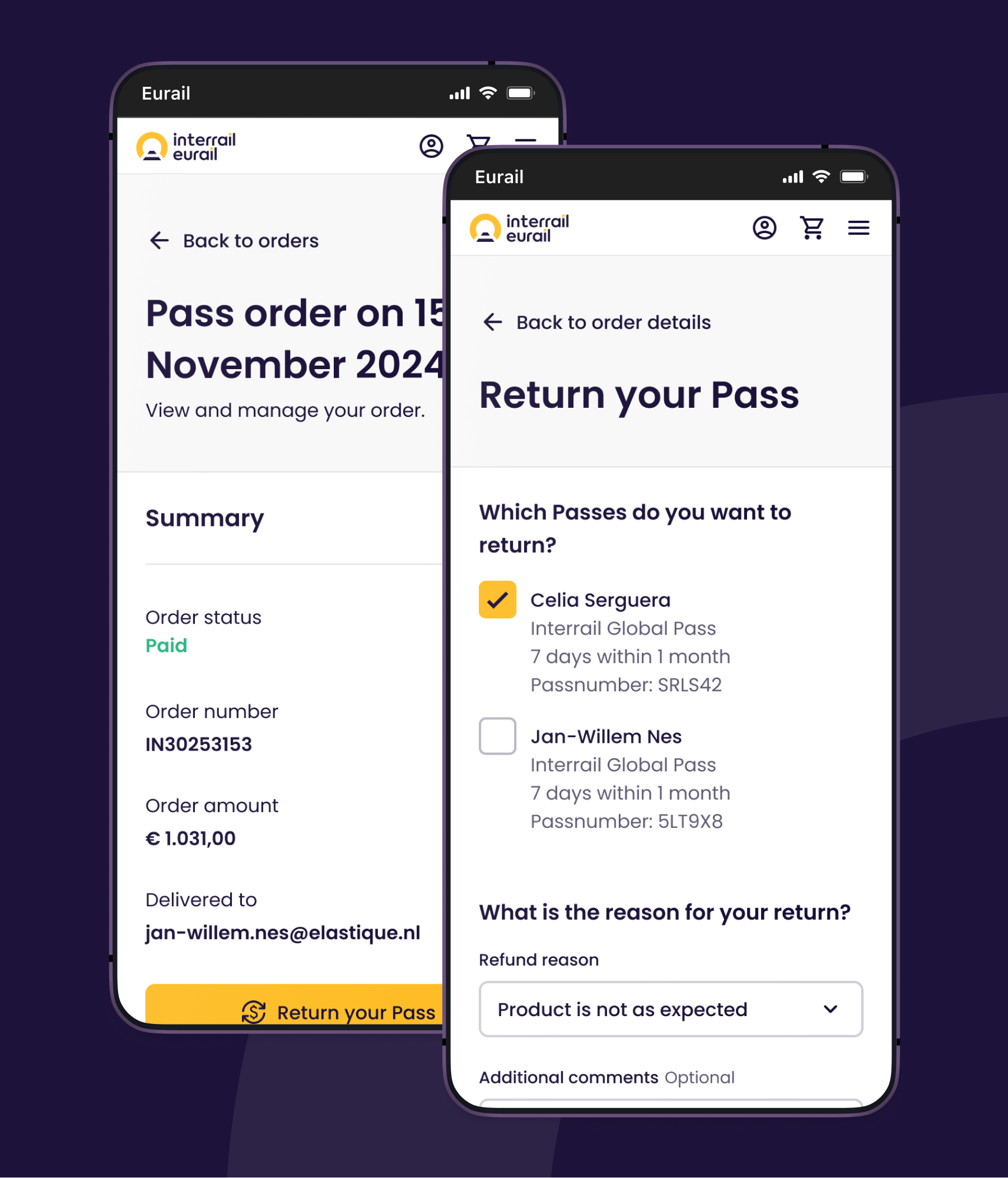
Chapter 2: Optimizing the Purchase Journey and Refunds
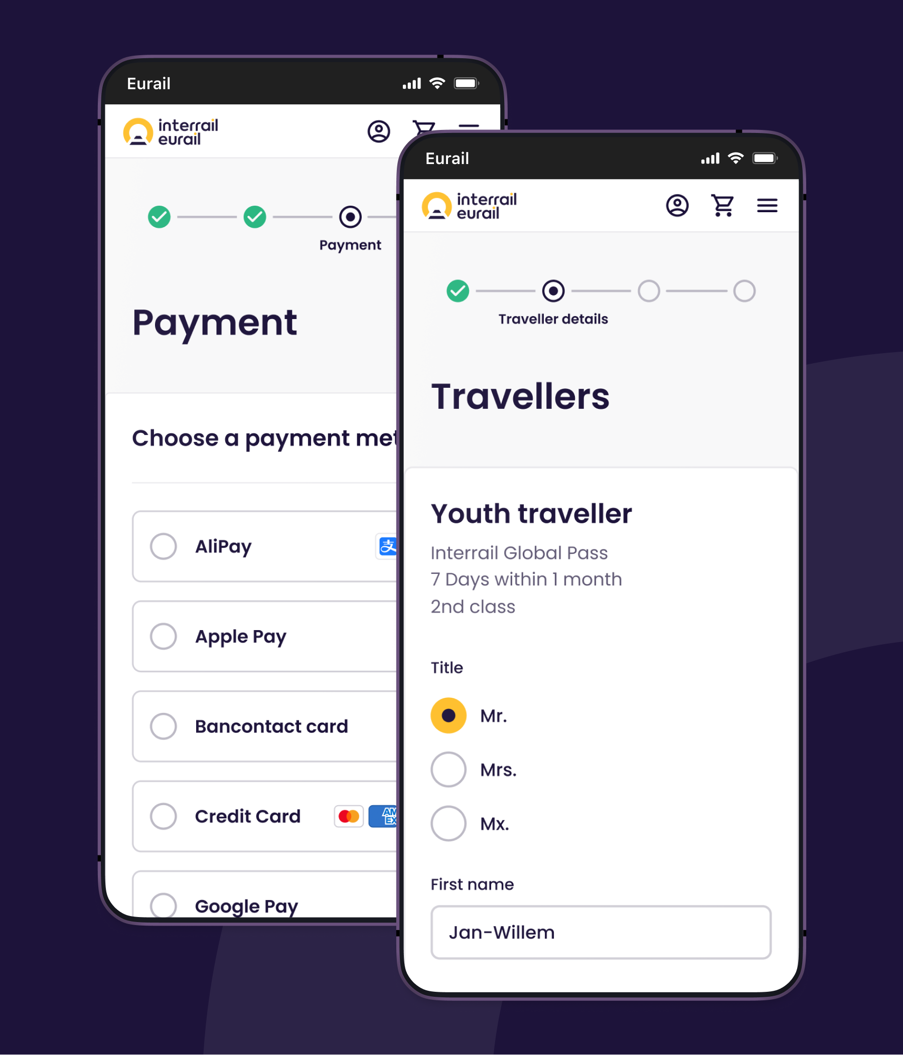
I moved from the app team to the web team to solve UX puzzles in the purchase journey and refund process. The Interrail Pass comes with a lot of product rules and conditions, which many travelers find confusing. It leads to customer service inquiries, pass refunds and customer dissatisfaction.
What was done:
- Removing deceptive patterns designed to drive sales
- Usability tests
- Easier traveller selection
- Transparent product conditions
- Optimised refund self-service and transparency over refund fees
Chapter 3: A case for accessibility
I felt accessibility was underconsidered in our processes, so I took the initiative to assemble a team to perform audits with a keyboard, screen reader and testing tools on our apps and website. Our services suffered from accessibility issues, with some users being unable to travel. This led to a pitch during the Innovation Month where I introduced accessibility and my findings. With the European Accessibility Act on the horizon, we urgently needed to make a shift in how we designed, developed and tested our digital services.
Accessibility became the top priority in the product teams to remedy issues.
- Audits of the website and app
- Workshops to raise awareness and share best practices
- Additional usability tests with users with different disabilities
- Collaboration across different disciplines to remedy accessibility issues
- Adjustments in the design system to solve at scale
- WCAG criteria part of acceptance criteria
- Audits by an external auditor
- Reporting to the Dutch ACM
"🎤 Voice-over: Transfer time, one hour and twenty-three meters"
This has been one of the more rewarding initiatives in which we've seen that accessibility moved from an afterthought to a shared responsibility across all of our product teams.
“The audits show that much of the website and apps are already quite accessible, and that accessibility has clearly been taken into account during development.” - Accessibility Foundation, 2025
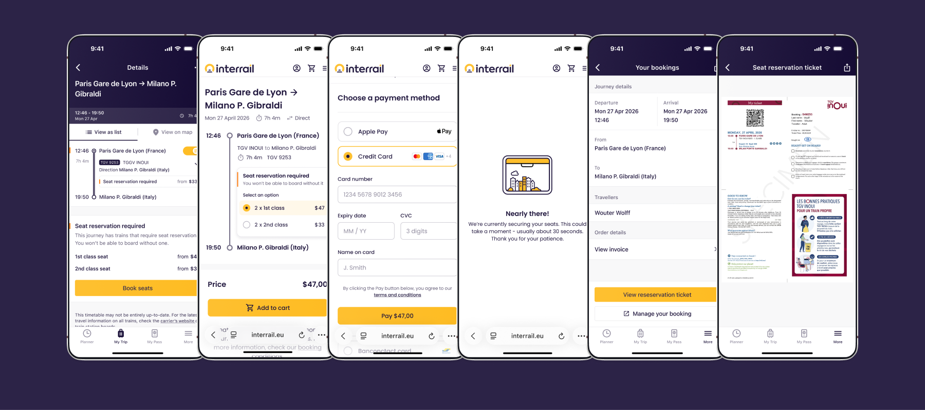
Chapter 4: Seat reservations
European rail travel gets more complex when having to deal with (mandatory) seat reservations. The additional cost, unavailability and having to obtain them from different rail operators can be difficult. The seat reservation mostly comes together with a point to point ticket. The general misunderstanding of the Interrail Pass is that it doesn't include costs for seat reservations. You think you're ready, but then you're not. In UX, it already sets us 0-1 behind.
The European Union is even introducing regulations for a one ticket service across all member states, aiming to simplify the ticketing process.
Interrail offers a self-service tool to book seats across different rail operators without needing to pay the full fare. But managing your trip and getting the reservations is a challenge.
Growth and Reflection
While the work continues, I'm already thankful for my journey at Interrail. I got the opportunity to work with a really diverse mix of colleagues and learn about their cultures. I researched user pain points, solve complex interface puzzles, learned about design systems and turn my interest in accessibility into practice. Above all, I got to travel with Interrail myself across beautiful landscapes and explore countries I hadn't visited before.